Page loading


L’homme au coin
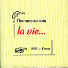
10 pages,
format 8,5 x 8,5 cm.
tirage à environ 30 exemplaires en typographie au plomb.
Thomas Braun
des fromages
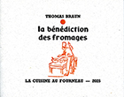
8 pages,
format 11,2 x 9 cm.
tirage à 131 exemplaires en typographie.
CLS
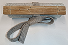
Un volumen,
79 cm de long, 17,5 cm de haut.
tirage à 10 exemplaires en linogravure.
Marie-Rose de France
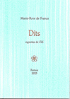
26 petits textes en proses poétique. Vignettes de CLS.
tirage à 120 exemplaires en typographie au plomb.
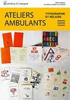
Flyer
Marie-Rose de France
|
|
36 p., format 10 x 14 cm. composé et imprimé en typographie au plomb Tirage à 120 exemplaires. (cliquer sur l'image pour en savoir plus) |

-

 Authors
 -
Chronological
- • 1977 (1-12)
- • 1978 (13-23)
- • 1979 (24-27)
- • 1980 (28-39)
- • 1981 (40-52)
- • 1982 (53-64)
- • 1983 (65-74)
- • 1984 (75-97)
- • 1985 (98-114)
- • 1986 (115-120)
- • 1987 (121-127)
- • 1988 (128-134)
- • 1989 (-)
- • 1990 (135)
- • 1991 (136-138)
- • 1992 (139-144)
- • 1993 (145-153)
- • 1994 (154-163)
- • 1995 (164-172)
- • 1996 (173-188)
- • 1997 (189-194)
- • 1998 (195-196)
- • 1999 (197-201)
- • 2000 (202-206)
- • 2001 (207-213)
- • 2002 (214-220)
- • 2003 (221-224)
- • 2004 (225-226)
- • 2005 (227-229)
- • 2006 (230-231)
- • 2007 (232-237)
- • 2008 (238)
- • 2009 (239-247)
- • 2010 (248)
- • 2011 (249-251)
- • 2012 (252-255)
- • 2013 (256)
- • 2014 (257)
- • 2015 (-)
- • 2016 (258-260)
- • 2017 (261-263)
- • 2018 (264-269)
- • 2019 (270-273)
- • 2019 (274-276)
- • 2021 (277)
- • 2022 (278-281)
- • 2023 (282-284)
- • 2024 (285-285b)
- • 2025 (286-288)
- • 2026 (289)
-
Des barbares...
... for those who are too lazy to seek.
-
Biblioteratology
- • 01. Chez les brocheurs [1]
- • 02. Chez les éditeurs[1]
- • 03. Chez les relieurs [1]
- • 04. Chez les relieurs [2]
- • 05. Chez les éditeurs [2]
- • 06. At the readers [1]
- • 07. Chez les éditeurs [3]
- • 08. Chez les éditeurs [4]
- • 09. Chez les éditeurs [5]
- • 10. Chez les relieurs [3]
- • 11. At the bookstores [1]
- • 12. Among layout designers [1]
-
Entertainments
-
Fin-de-Siècle
-
Fourneau and Fornax
-
Printings
-
Typography
14550541 visitors
100 visitors online


To my friend Jean-Paul Goujon
“You didn’t post your usual piece last Monday…”
“Nope…”
“Couldn’t be bothered?”
“Nope. I was ill…”
“Oh! And that stopped you writing your post?”
“Well, yes… I wasn’t much in the mood. I decided the best way to nurse myself back to health was to do absolutely nothing.”
“And did it work?”
“Well, yes, a little. It does you good to do nothing every now and then. Gives you a rest. And rest can be a bit of a cure in itself, sometimes.”
“Yes, but not always…”
“No, not always… but in this case, yes. A little…”
“And are you going to write your post after all?”
“Well, yes. I’m writing it right now…”
“Oh, I see… In that case, I’ll leave you to it.”
“Thank you…”
I’m not one to complain, but some people are really quite… Anyway, let’s move on.
Now, let’s see… Ah, yes! A little while ago, certain people—ill-mannered souls, no doubt—responded to my work with a rather eloquent curl of the lip and remarks along the lines of: “Er, don’t take this the wrong way, but all that stuff you write about printing and technology… well, how shall I put it? We couldn’t give a damn!” Always a pleasure to hear, isn’t it? So, just to be absolutely clear, I’m not changing the subject to please them. Not at all. I’m changing it because, as someone once said, I simply can’t be bothered to carry on with the usual stuff. I’m not feeling particularly sprightly or full of beans just yet.
I’ve therefore decided to indulge the devotees of fin-de-siècle literature—that is, literature from the end of the nineteenth century—and its early twentieth-century successors. Some fifty years ago, there weren’t all that many of us who knew about this literature, let alone appreciated it. Nowadays, you can hardly get a foot in the door for the crowds. Times change. It’s like the weather: things are warming up.
So here’s what I propose. I’ve taken an issue of a literary magazine from a shelf in my library—one within easy reach, which isn’t true of all of them. I picked it more or less at random. Did chance do me a good turn? I think it did, but you can be the judge.
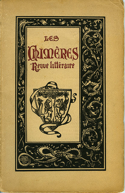
Les Chimères
A poetry magazine, published on the fifteenth of every month
Paris, 76 rue du Rocher
Volume II, No. 11 — 15 February 1909 — 28 pages
Editor-in-chief: Adrien Bertrand
Editorial committee: Guy Robert du Costal, Alfred Machard, Claude-Léon Mercerot, Vincent Muselli, Henri Grach
Secretary-general: Henry Bertrand
Administrator: René Emanuelli
Contents
Émile Boissier, “Annick” — A poem dedicated to Frédéric Mistral, consisting of eleven quatrains in ten-syllable lines.
Guy Robert de Costal, “Sonnets” — Two monosyllabic sonnets, the first of which I simply cannot resist quoting, in french, of course:
La More
Dort
Son
Corps
Blond
Sur
Le
Lit
Dur.
Frêle
Sœur
Qui
Gît !
Pâle
Fleur…
Roger Vincent, “Souvenir” — “Chanson” — “Idylle anglaise” — Three poems: a sonnet; a poem comprising six quatrains of three seven-syllable lines and one two-syllable line; and a poem of ten quatrains in eight-syllable lines.
Adrien Bertrand, “La Douleur” — A poem dedicated to Théo Mittelsten Scheid, consisting of six six-line stanzas in alexandrines.
Alfred Machard, “Une escapade” — A short story featuring the child characters the author was so fond of.
E. Aubel, “Sonnet” — A sonnet in alexandrines, dedicated to Louis Perris.
Gaston Guilleré, “Mimodrame” — A sort of prose poem featuring the character of Pierrot.
Vincent Muselli, “Poème” — A poem consisting of three quatrains in alexandrines, dedicated to Édouard Marye.
André Petit, “L’Éveil de l’été” — A sonnet in alexandrines.
Edmée Delebecque, “Supplique” — “Dédicace” — Two poems in alexandrines: the first consists of seven quatrains, the second of sixteen lines.
Xavier Thylda, “Celles qui passent…” — “Dormeuse” — “Stances” — Three poems in alexandrines: two sonnets and a poem of two quatrains dedicated to Guy Robert du Costal.
André Petit, “Nuit” — A sonnet in alexandrines.
“Une Matinée” — An anonymous review of a literary matinée held at the Lemoine Hall, 17 rue Pigalle.
Finally, a statement by Adrien Bertrand announcing his resignation as editor-in-chief of the magazine so that he could take up the mantle of secretary to the committee charged with erecting a monument in honour of Catulle Mendès, who had recently ceased to be immortal.
***
“Tell me, sorry to butt in again… These chaps in your magazine aren’t exactly household names, are they?”
“No, they aren’t.”
“And if they seem rather partial to women, they don’t appear to pay them much attention. Not a single woman in the contents… So why are you bothering to write about them?”
“Oh, just to make them a little better known…”
“Right… Fair enough. But do you really think your pathetic little blog post is going to make your second-rate poets famous?”
“No, probably not… But perhaps some newly converted fin-de-siècle enthusiast might be tempted to dig a little deeper and take an interest in one or another of them. You never know…”
“Hmm… Possibly. But now that I think about it, your obscure dreamers seem a pretty reactionary bunch, what with their sonnets on every street corner. Not exactly modernists, are they? They don’t seem to invent much, with all that ice-cold classicism of theirs. They churn out alexandrines by the yard…”
“Fair point… But they do help us build up a little picture of the period. The Symbolists are more or less behind us, and Dada won’t be long in coming. In the meantime, there they are, these fellows… still here, just before the Great War comes along and kills them.”
“Hmm…”
Not so long ago, as you may remember, I announced here that all the newly arrived Stanhope was still missing was an inking table before the press would have everything it needed to get properly to work. Well, that’s sorted now. The Stanhope has its inking table. And it has even more than that: it now has its very own cans of cleaning fluids, each one sporting a fine label printed in the workshop—black lettering on fluorescent orange paper, so you can’t possibly miss them. Come on, let’s have a look at the pictures…
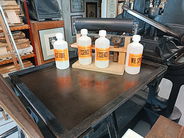
The four cans are sitting on the Stanhope’s bed, each with its handsome label and each filled with its own particular cleaning fluid. They are lined up in front of the two-handled hand roller: acetone, F-type solvent, C-type solvent, and white spirit (also known as turpentine).
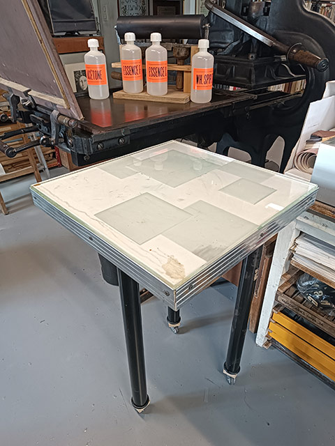
And here is the homemade inking table, cobbled together from all sorts of odds and ends, some of which have been kept for years with the thought: “These little bits and pieces might come in handy someday for making some sort of thing or other. You never know!”
But, but… oh horror!… we discover that the tabletop, made of genuine glass more than 5 millimetres thick, is absolutely filthy. Quick clean-up!
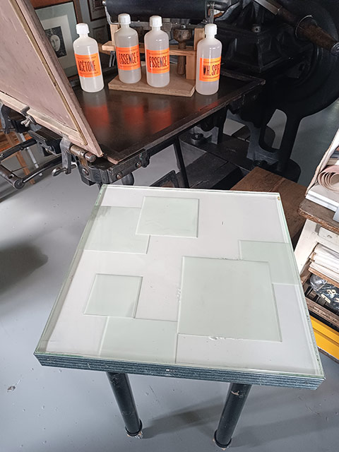
There, that’s better. With the tabletop this clean, even if we want to ink in white, there’s no danger of dirtying the colour… provided, of course, that the inking roller itself is properly clean too.
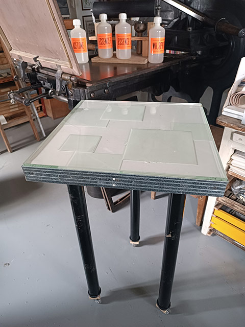
The table has only three legs, but they are fitted with casters, so it can easily be moved around. It wasn’t a deliberate decision to give it only three legs. It’s simply that, in our stockpile of odds and ends for making things out of, we could only find three. So we made do with what we had.
But admit it, it does have a certain style, this little table, with its Art Deco glass and its pretty embossed tin edging. Doesn’t it? You disagree?… Never mind. I don’t care. I like it…
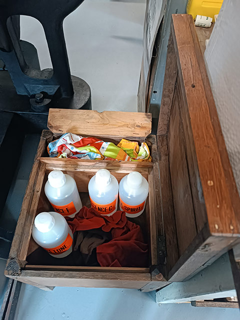
To complete the little setup, let me introduce you to this small box on legs (it has four of them!) which a friend gave me because he no longer had any use for it. I use it to store rags and cans of cleaning fluid. The clean rags, waiting patiently to get dirty, are kept in a small compartment that can be closed with a hinged lid. It’s rather sweet.
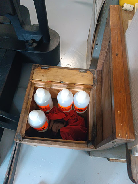
The little lid is closed.
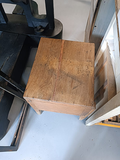
The large lid of the box is closed as well…
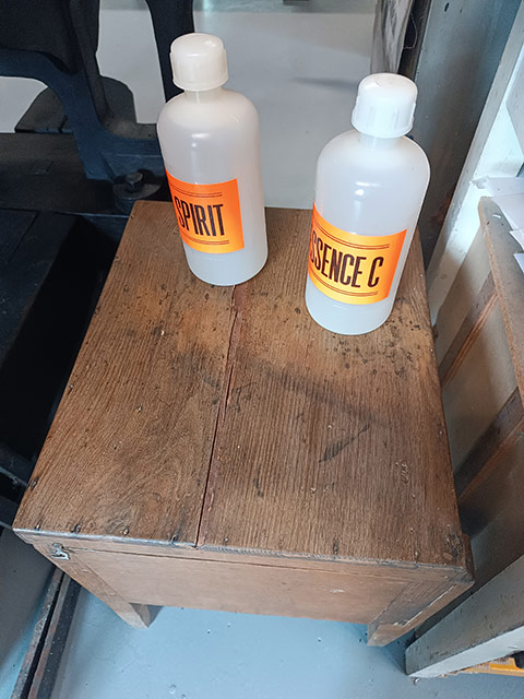
… and the cans of cleaning fluid can be placed on top. Wonderful, isn’t it?
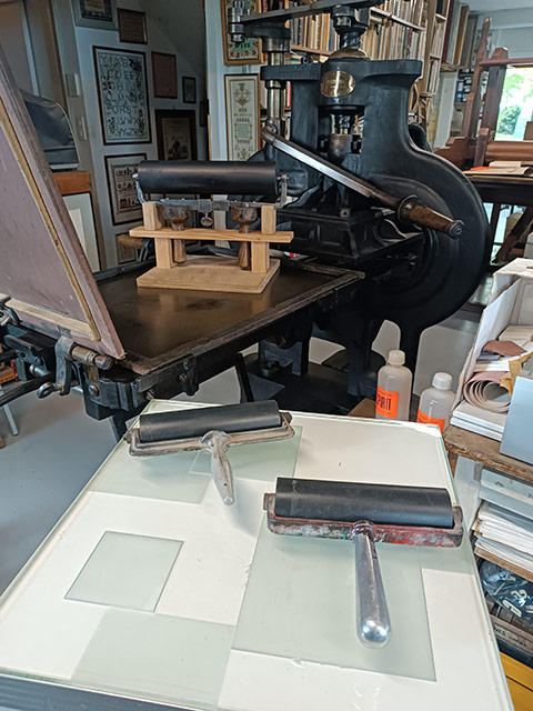
You can also put other hand rollers on the inking table, smaller ones…
—Yes, yes, very nice indeed, old chap, but when are you actually going to use that press of yours?
—Well, er… pfff… when my back hurts a little less from pulling on the bar… Soon… soon…
There are days like that when you get up in the morning simply because you have to get up… So you get up, gloomy, thinking to yourself: “Ah! Another new day to get through…” and you set about living it, somewhat reluctantly and under duress. But nothing turns out the way you expected. The day you thought would be long, sad, and boring actually turns out to be filled with joy, wonders, and discoveries. That’s how it is—you can’t stay in the doldrums forever.
It was the contents of the mailbox that changed everything. I wasn’t expecting anything, and in fact I was half expecting a letter bearing bad news from the tax authorities or some energy provider. But instead, there was a large, beautifully made package from—oh, the surprise!—the United States. It was such a beautifully put-together package that it took me quite some time to open it, which only served to heighten the adrenaline and, consequently, the joy of discovering what was inside.
Intense joy… indeed.
What was in the package? A book. But not just any book. An important book. A landmark book. A definitive work on its subject: the typefounder's hand mould. Those moulds, as you know, were used to cast type before automatic typecasting machines were invented in the nineteenth century, followed by typesetting machines; long before the twentieth century brought us phototypesetting, and later the computerised typesetting we still use today. Without type moulds, there could have been no large-scale reproduction of the written word from Gutenberg to the dawn of mechanical typesetting.
So a type mould is no small thing. It is a cultural artifact in every sense of the word. It made the mass reproduction of writing possible; and in itself—in the way it was made, and in the way it evolved over the centuries—it stands as a remarkable expression of technological culture.
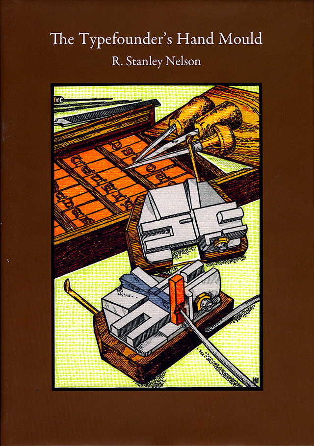
Cover.
The author of this book, Stan Nelson, is quite simply the world’s foremost authority on the subject, universally recognised as such. The book is the fruit of a lifetime of research, carried out in every country where movable-type printing has existed since the middle of the fifteenth century.
In other words, it is an indispensable book for anyone interested in traditional printing, in books, and in the technology that made them possible. As Bela, a Congolese author I published back in the last century, used to say: “It's good the Book!” And this one is not merely lavishly illustrated—it is lavishly illustrated in colour, if you please! It is a work of historical and technological scholarship that will be very hard to surpass. One might perhaps write another book on the subject after this one, but certainly not a better or more comprehensive one.
But… I can already hear the grumbling, buzzing away in my ears here and there… Grumbling, after all, is one of our great French national characteristics, a trait we are famous for the world over. We French are always grumbling.
—The book you’re talking about—it’s from the United States, isn’t it?
—Well, yes…
—So it’s in English…
—Well, yes…
—Yes, but we speak French here in France…
—Well, yes… but there’s nothing to stop us speaking English too, reading it, and understanding it. That’s part of being educated, isn’t it? And besides, the pictures are written in “picture”—a universal language. When you come across a book like Stan Nelson’s, you don’t sit around waiting for some hypothetical French translation that will probably never appear.
—Oh really? And why not?
—Because France, so proud of its famous cultural exception, has largely lost interest in traditional technologies—unlike the countries around us. And the little community of people who still care about such things is simply too small for anyone to contemplate publishing a French edition.
So, you lot: if the subject interests you, read the book in English! For heaven’s sake! And talk about it to everyone you know. That way, perhaps, we’ll make this little community of enthusiasts a little less little…
—But you can’t get the book in France…
—I don’t know about that, but you can always order it. Come on, I’ll scan the back of the dust jacket for you. All the information you need will be right there. See how kind I am to you?
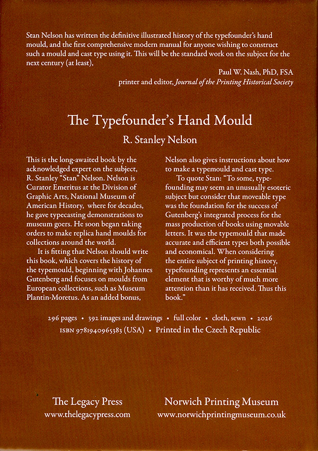
Back cover.
—But why did you get it in the mail? Did you order it?
—No. He was kind enough to send me a copy when it was published because I had given him some photographs of a mould that he discusses in the book. A few years ago, I had written a fairly substantial article about that particular mould, but it was never published because the journal it was intended for never saw the light of day.
—So you got the book for free…
—Well, yes…
—You lucky devil.
—Well, yes… You have to have a few little joys in life now and then—or some really big ones—that give you a reason to get out of bed in the morning…
Une trouvaille lors de la brocante d’hier. La seule de la journée, pas vraiment ruineuse : 2 €, pourquoi se priver ! Ce spécimen de papiers de couverture date sans nul doute des années 1910-1920, période Art nouveau, si l’on en croit les illustrations utilisées. Comme on aime bien cette période des arts graphiques et qu’on ne vous déteste pas non plus, on vous le reproduit en entier, ce catalogue. Z’avez intérêt à apprécier.
La prise de vue un peu trop rapidement réalisée frise l’innommable et le catastrophique. Il vous faudra pourtant vous en contenter. On n’a pas pu faire mieux. On a collé le catalogue sous une plaque de verre pour le raplaplater mais ça a causé des images parasites par réflexion du photographe sur le verre. De plus, on ne sais plus où on a fourré le statif de reproduction qui nous aurait permis d’obtenir des pages rectangulaires ; on a fait la prise de vue à l’arrache…
— Eh, banane ! pourquoi tu ne l’as pas scanné, ton catalogue ?…
— Parce que le catalogue dépassait de la vitre du scanner, pomme à l’eau !
Euh, si on passait aux images après cet échange de fruits et légumes…
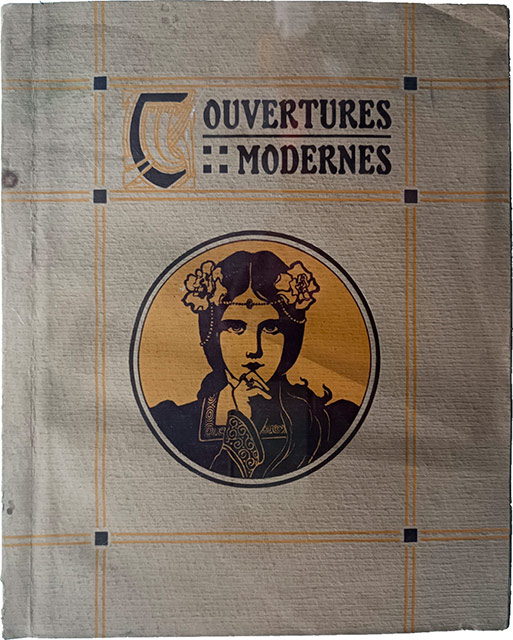
Couverture.
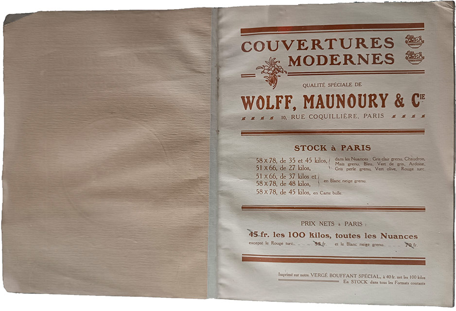
Pages 2 et 3.
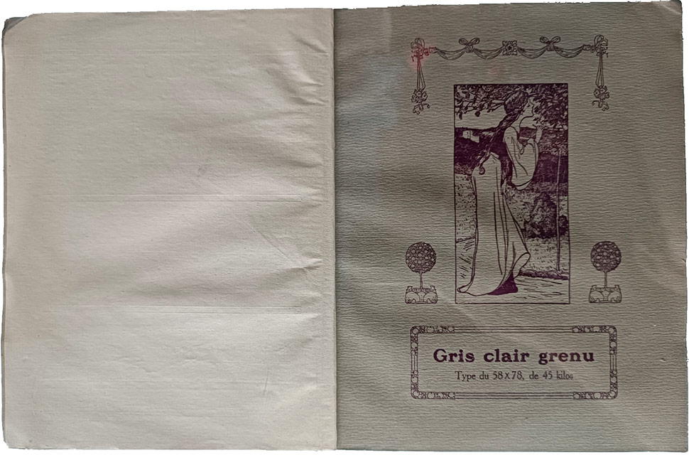
Pages 4 et 5.
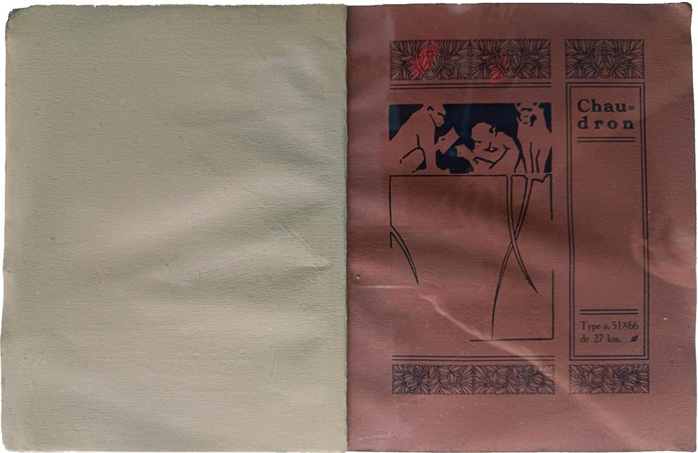
Pages 6 et 7.
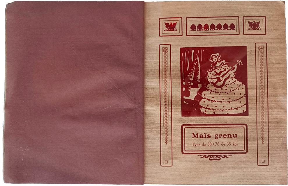
Pages 8 et 9.
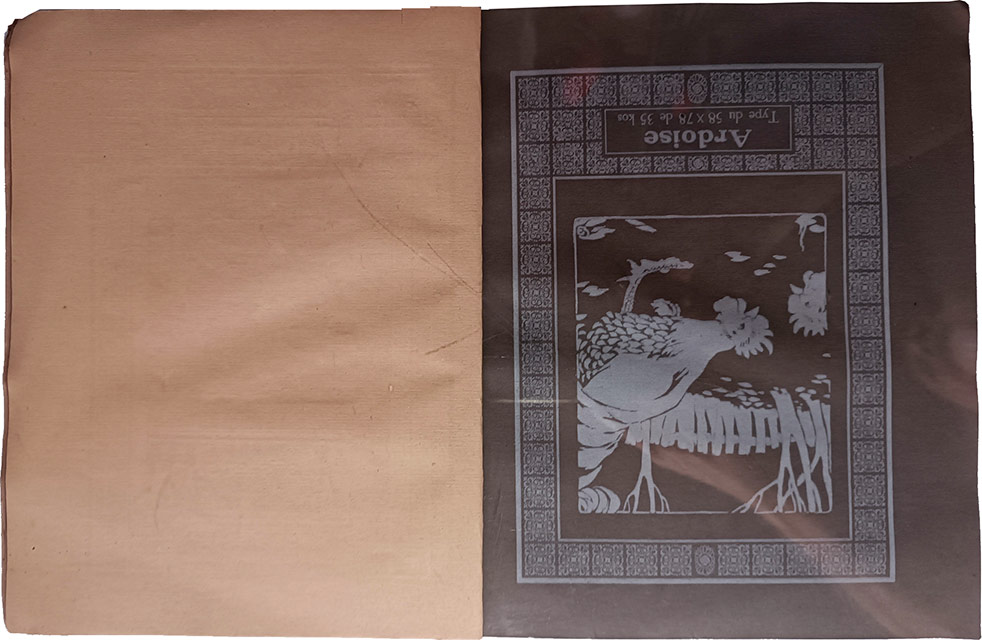
Pages 10 et 11.
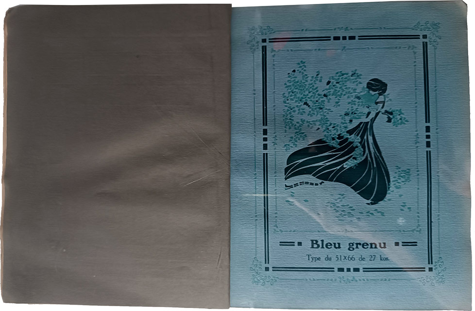
Pages 12 et 13.
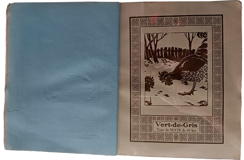
Pages 14 et 15.
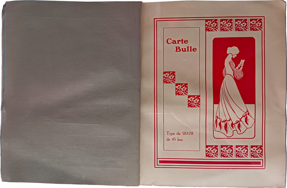
Pages 16 et 17.
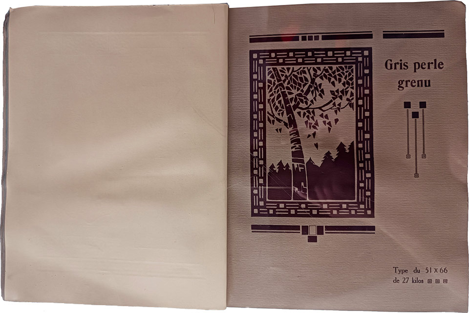
Pages 18 et 19.
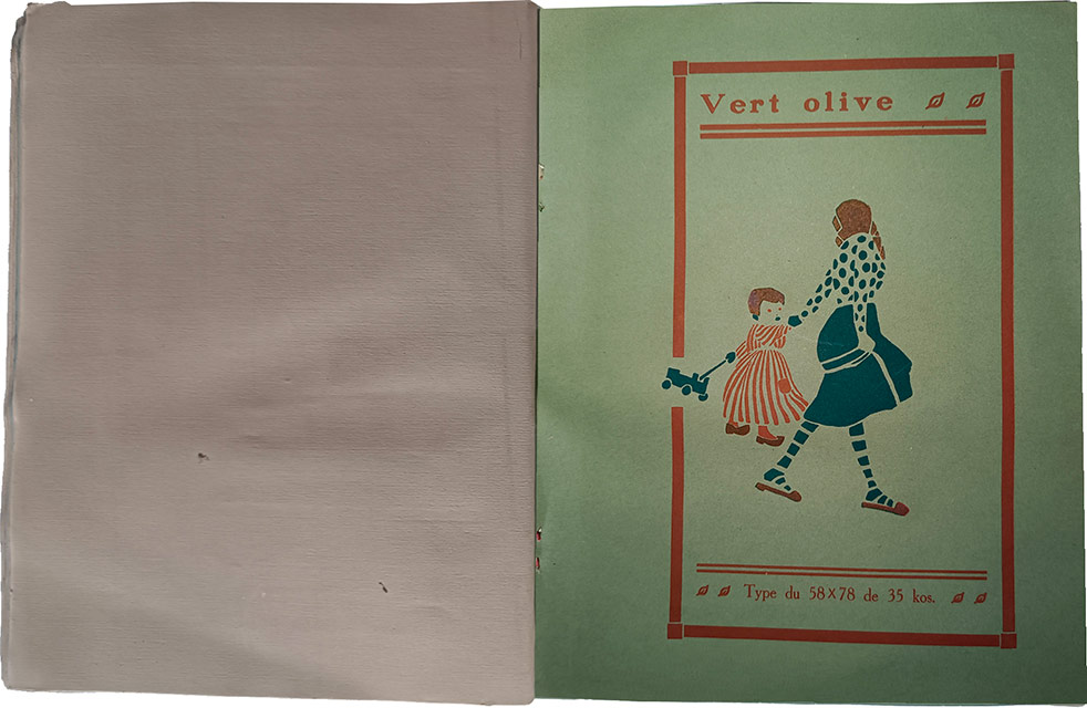
Pages 20 et 21.
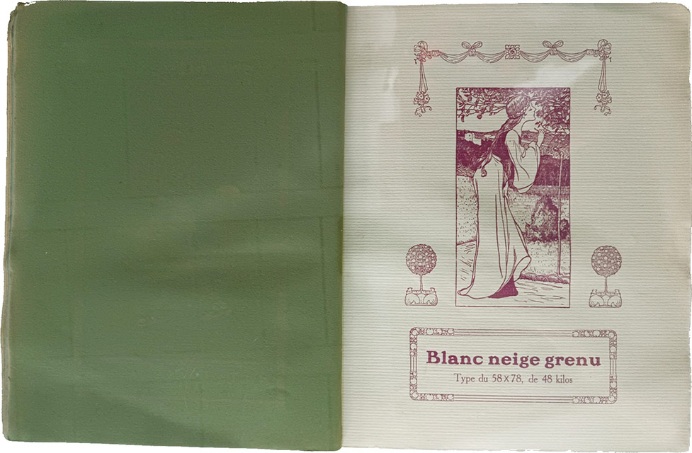
Pages 22 et 23.
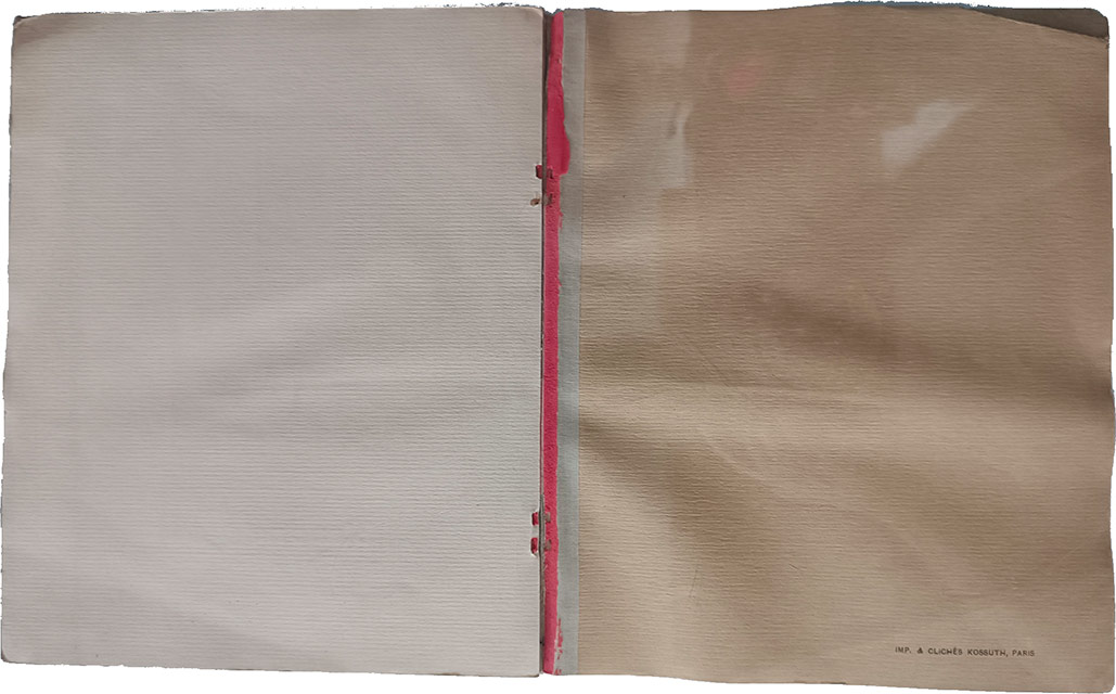
Pages 24 et 25.
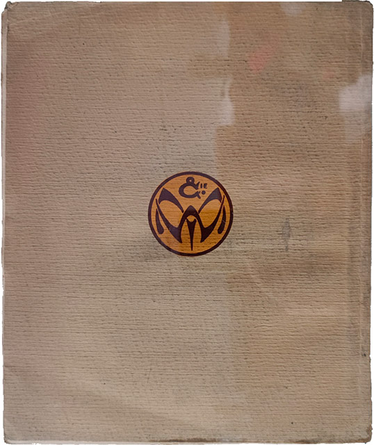
Page 26.
Voilà… Plein de jolies couleurs de papier et de jolies couleurs d’encre… à la semaine prochaine pour — peut-être — de nouvelles nouvelles…
L’histoire du rouleau encreur de la semaine dernière nous a fait revenir vers un passé assez lointain, celle d’aujourd’hui s’inscrit dans le présent.
Complément idéal de la Stanhope nouvellement arrivée chez Fornax, et arrivé quelques jours avant elle sous la forme d’un cadeau du confrère vendeur, un gros et lourd rouleau encreur à deux poignées. On l’aura bien compris si on a lu les récents billets sur l’arrivée de la Stanhope et sur son entretien, cette presse n’a aucun système d’encrage automatique de la forme d’impression : il faut encrer à la main. Ce qui n’est pas un problème si l’on est soigneux et si l’on a le bon matériel.
Ce rouleau donné pouvait donc postuler au grade de compagnon idéal pour la presse. Hélas, il me fut confié bien malade. Un de ses deux poignées avait disparu et il était recouvert — rouleau et manche — d’une impressionnante couche d’encre, essentiellement noire. En l’état, il était impossible de s’en servir. Il fallait le restaurer. Sans la deuxième poignée, aucune utilisation possible, une poignée de remplacement était donc nécessaire. Mais pour pouvoir la fabriquer, besoin d’un tour à bois. Trop cher d’en acheter un pour une utilisation unique, il fallait en improviser un. Ce qui fut fait. Mais au moment de l’utiliser pour transformer une petite bûche de bois de laurier en poignée de remplacement, le confrère retrouve la poignée manquante et me la donne. Merveille ! Son âme métallique était cassée. Extraction de la poignée et soudage sur la partie métallique du manche, après un bon nettoyage de l’encre sur le manche et sur les deux poignées. Réassemblage du tout ; restauration terminée ! Le rouleau pouvait de nouveau servir après deux jours de boulot. Il est devenu le plus grand rouleau à main utilisable de l’atelier, si l’on excepte les rouleaux pour la lithographie. Qu’on en juge. Poids : 5 kg ; longueur du rouleau : 38 cm ; diamètre : 9 cm. Une belle bête.
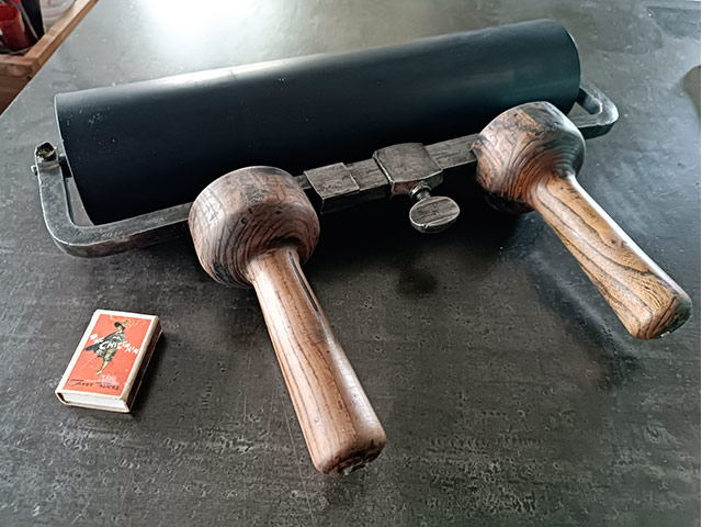
Comme on n’a pas pensé à prendre des photos pendant la restauration (on ne saurait penser à tout, surtout qu’on ne savait pas si on allait parler de ça dans un billet), le voici tout restauré. La boîte d’allumettes de petit format à côté de lui est là pour donner une idée de sa taille.
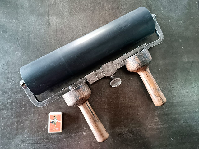
Le même, vue de dessus.
Mais ce rouleau a toutefois un petit défaut. Il n’a pas de pieds qui permettent de mettre le cylindre de caoutchouc hors de tout contact lorsqu’il n’est pas utilisé. Ce qui peut conduire à créer dés méplats lors d’une inutilisation prolongée. Qu’à cela ne tienne, on n’est plus à ça près, on va lui fabriquer un support. Aussitôt dit, aussitôt fait, on le fabrique avec des planches de récupération. Contreplaqué pour le socle, sapin pour la planche à trous (pour les manches) et pour les pieds inférieurs, chêne pour les supports de la partie métallique. Une petite journée de travail tout de même !
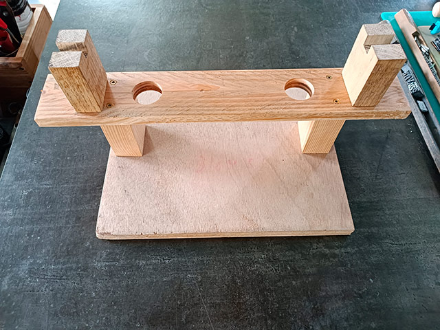
Le support, vue de face.
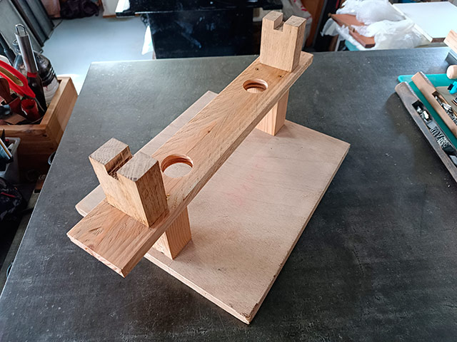
Le support, vue de trois-quarts.
Ainsi conçu, ce support sert également pour le nettoyage du rouleau après impression. Faut bien penser à tout, hein ! Maintenant, pour pouvoir utiliser la Stanhope et son copain le rouleau à deux manches, il ne manque plus que la table à encrer.
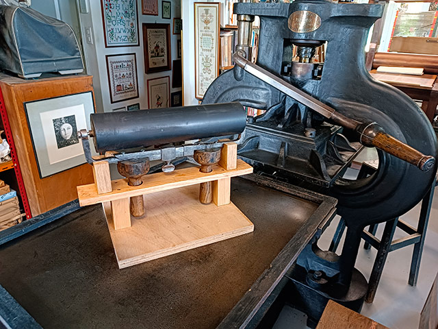
Le rouleau sur son support, posé sur le marbre de la Stanhope.
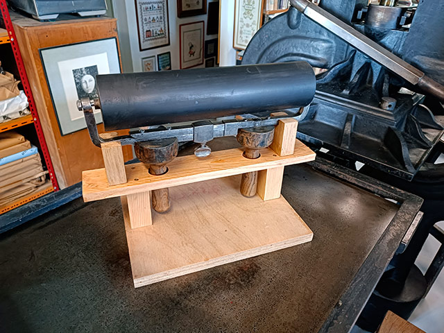
Vue rapprochée.
Le matériel (de récupération) a été réuni pour fabriquer cette table… va falloir s’y mettre…
Undergrowth typography
- • Attentiveness
- • Questioning
- • Begining
Typographical practice
- • Mould
- • Letterpress for beginners
- • Blains printing museum
- • A post card
- • A post card
- • Marabouts from A to D
- • Treading
- • Visit to Bannes
- • Homework
- • Curving machine
- • Haas and Frutiger
- • K crossed out
- • Word stamp
- • Hatching
- • Gutenberg in comics [2]
- • Champagne Printing Museum
- • Stamp
- • Gutenberg in comics [1]
- • Subscribed signs
- • Typofeminism
- • Rebais house of Printing
- • Cedilla
- • Versatur
- • Ben-day
- • Letters
- • wood types
- • Tours typography museum
- • Old book
- • Types...
- • Abbreviation
- • Height to paper
- • Mystery font
- • Typographic old times
- • Cleaning up a Della Robbia case
- • Type case [2]
- • Type case [1]
- • Bijou typographique n° 2 Émile Teillac
- • Restoration of an typo case
- • To murder the typo?
- • Little brother
- • Wishes 2014
- • Mould & library
- • Wishes 2013
- • Chromotypography
- • Wishes 2012
- • Decoration
- • The tools of the workshop [9]
- • The tools of the workshop [8]
- • The tools of the workshop [7]
- • The tools of the workshop [6]
- • The tools of the workshop [5]
- • The tools of the workshop [4]
- • The tools of the workshop [3]
- • The tools of the workshop [2]
- • The tools of the workshop [1]
- • Attrape-science
- • Drawing of the letter
- • Handbook
- • Atelier de Saint-Maur
- • Au courant
- • Gutenberg
- • Format typographique
- • Summer journey
- • Apostrophe
- • Baguette
- • Saint-Jean
- • Childishnesses
- • Logo
- • New typography at Estienne school
Typo des rues
Tools
- • Table
- • Specimen
- • Roller
- • Bellows
- • Invention patent
- • Magnifying Glass
- • Autograph presses -2
- • Autograph presses -1
- • Copy press
- • cardboard shears
- • Shear
The picture of the day...
- • Fresco
- • Treasure
- • Black and white
- • Papaver
- • Little prince...
- • Vegetable garden
- • Gâteaux
- • Macrosillon
- • Mills
- • Ring
- • Noise
- • Hedgehog
- • Hell
- • Sheep
- • Writing
- • Procrastination
- • Buffalo
- • Free
- • Enameled sheet metal
- • Emergency
- • VGT
- • Advice
- • Crucifixion
- • Plane tree (bis)
- • Garbage can
- • Pencil
- • Berries
- • Foresightedness
- • Heritage (continued)
- • Heritage
- • Mona
- • Craftsmen
- • Carrot
- • Ladybug
- • Punning signs
- • Weather report
- • Velocipede
- • Mysterious shop
- • Plane tree
- • Cathedral
- • Dissent
- • Heart
- • No entry
- • A-Z
- • Glass harmonica
- • Silence
- • Decentralization
- • Things
- • Julie
- • Socks
- • Cats (continued)
- • Rebus
- • Tit
- • Cats
- • Linen
- • Love story
- • Bowltree
- • Man
- • Athée (atheist)
- • Supposition
- • Cocktail
- • Arago
- • Hopscotch
- • Watchdog
- • Road safety
- • Queue
- • Tradition
- • Freedom
- • Curl up into a ball
- • Revelation
- • Chocolate
- • Easter Bunnies
- • Exhortation
- • An attempt...
- • Duplicity
- • Ores
- • Models
- • Estienne school
- • Anonymous letters
- • Heads
- • Game
- • Box
- • Consultant
- • Reflexions
- • Rain
- • Stencil and graffiti
- • Green
- • Nocturnal
- • Silence
- • Bliss
- • Volumen
- • Lack
- • Ant
- • Tube
- • Torn paper
- • On the ground
- • On the country lane
- • Music
- • Shift
- • Pâté
- • Wash
- • Pose
- • Ban
- • Come back at Ognes
- • Butcher's shop
- • Tower
- • Underground french humor
- • Four colors
- • Sleeping Cinderiding hood
- • In color
- • Road
- • Shadow puppet show
- • Chair
- • December 31
- • December 31
- • D day
- • TBlue
- • Titanium or zinc?
- • Flakes
- • Potesses
- • Old story
- • Solution
- • Credit
- • Horses
- • History
- • Abandoning
- • Camping
- • Declaration
- • Home
- • Crise
- • Memento mori
- • Anges...
- • Dressage
- • Rien
- • Décoration
- • Retraite
- • Bas-relief
- • Autumn
- • Imitation
- • Expedition
- • Repiquage
- • Croquenots
- • Godasses
- • Vint le vain vin
- • Désertion ou expulsion
- • In the street...
- • At the bookseller...
- • Come back
- • Rencontre
- • Baby
- • Apple
- • Striptease
- • Book shop
- • Counters
- • Spring
- • Vertus
- • Pavés
- • Curiosities
- • Handcuffs
- • Sens
- • Festive
- • Questions
- • Flowers
- • Order
- • It does not run any more...
- • It runs...
- • Cat (2)
- • Apprentice
- • Gifts
- • Seal
- • Bourse
- • wine
- • 2009
- • Art
- • Cat
- • Bred
- • Streets
- • Games
- • Red and bearded in December (an another image)
- • Maritime prefect
- • Pleonasm?...
- • Wink
- • Renewal.
- • Shadow
- • Mis-spelling
- • Laughter
- • here
Tales ans short stories
- • Papillote joke
- • Passe-muraille
- • Cluttered sidewalks
- • Poem
- • Bursery rhyme
- • Life &nd comic strip
- • Poetry...
- • literary games
- • Do nopt...
- • Pavement
- • cardboard packaging
- • Mauricette
- • Edge
- • The killer bathtubs
- • The woodeaters
- • Incognito
- • Anonymous
- • Fish (end)
- • Fish
- • On the valley
- • In the street
- • Birth of stars
- • Fly
- • Tourism
- • Mars en mai
- • Hygienic
- • Return
- • Tale
Streets typography
- • Beautiful sentences 42]
- • Signage
- • Sign painter
- • Stone engraving
- • Vécé
- • Readability
- • Beautiful sentences 41]
- • Paint
- • Crochet typography
- • Wild poster
- • Composite
- • Beautiful sentences [40]
- • Composite signs
- • Street signs
- • Polyglot
- • Sculpted typography
- • Apostrophe
- • Stencil-sign
- • Beautiful sentences [39]
- • Spraying
- • Stencil
- • Scandinavian
- • Beautiful sentences [38]
- • Accent
- • Cheeseshop
- • Beautiful sentences [37]
- • Iron forged letters [11]
- • Beautiful sentences [36]
- • Braille
- • Beautiful sentences [35]
- • Beautiful sentences [34]
- • Shadow
- • Mosaic
- • Hairdersser
- • Palimpsest
- • Beautiful sentences [33]
- • Roof
- • Beautiful sentences [32]
- • Beautiful sentences [31]
- • Cow
- • Dog
- • Iron forged letters [10]
- • Beautiful sentences [30]
- • Beautiful sentences [29]
- • Iron forged letters [9]
- • Streets names
- • Beautiful sentences [28]
- • Beautiful sentences [27]
- • Painted storefront
- • Inverted types
- • Gutenberg
- • Beautiful sentences [26]
- • Funeral Typography
- • Beautiful sentences [25]
- • Painted sign
- • Accents
- • Typographic sign
- • Rich
- • Calligraphed sign
- • Pixelation
- • Beautiful sentences [24]
- • Beautiful sentences [23]
- • Iron forged letters [8]
- • Generations
- • In the window
- • Street sign
- • Grammar
- • For typographers
- • Multiple choice
- • Beautiful sentences [22]
- • Beautiful sentences [21]
- • Signs
- • Question of perspective
- • Colors of love
- • The art of correction
- • Beautiful sentences [20]
- • Signboard
- • Beautiful sentences [19]
- • A little bit of everything
- • Love typo
- • Glazed ceramic
- • Bright typography
- • Family
- • Beautiful sentences [18]
- • Bell
- • Typographic Avaricum
- • Iron forged letters [7]
- • Iron forged letters [6]
- • Execution of letters
- • Beautiful sentences [17]
- • Beautiful sentences [16]
- • Palimpsest
- • In
- • Rhesus
- • Vegetal typography [2]
- • To dot the i's
- • Beautiful sentences [15]
- • Military
- • Cedilla
- • Military
- • Military
- • Beautiful sentences [14]
- • Electricity
- • Front
- • Beautiful sentences [13]
- • Drop of milk
- • Painted sign
- • Iron forged letters [5]
- • Beautiful sentences [12]
- • Beautiful sentences [11]
- • Area
- • Sign
- • Beautiful sentences [10Prose de gouttière]
- • Beautiful sentences [9]
- • puny tribute
- • Beautiful sentences [8]
- • Iron forged letters [4]
- • Printing works [7]
- • Bar-barisme
- • Iron forged letters [3]
- • Shadow
- • Other iron forged letters
- • Beginning and end
- • Iron forged letters
- • Beautiful sentences [7]
- • Printing works [6]
- • Dates
- • Roman numerals
- • Chimney
- • Chocolate
- • Beautiful sentences [6]
- • Credit lyonnais
- • Diaeresis
- • Printing works [5]
- • Printing works [4]
- • Plate
- • Typo versus Batman
- • Mingling
- • Recycling
- • Hand made [2]
- • Hand made
- • Vegetal typography
- • Orientation
- • Waffle
- • Ad
- • Commonplaces
- • li
- • Stencils
- • Beautiful sentences [5]
- • Neighborhood
- • Kerning
- • Printing works [3]
- • Caractère
- • Beautiful sentences [4]
- • Printing works [2]
- • Printing works [1]
- • Beautiful sentences [3]
- • Signs
- • Wishes 2011
- • Ion
- • Stuttering
- • Beautiful sentences [2]
- • Beautiful sentences [1]
- • Mystical
- • Shop window
- • Interdit
- • Solutions bétonnées
- • Typo béton
- • Oz
- • Enigma
- • Terrible
- • Lecture
- • Épitaphe
- • De bric
- • Butcher's shop
- • Alphabet
- • Typo t(h)in
- • Weaving
- • Carmelites
- • Adéquation
- • Big dot
Spirit of the times
Rural typo
- • Botanical typography
- • Goal
- • Straw typo
- • J in the mist
- • A of the electric pole
- • Break
- • Champagne
- • B of the road sign
- • Wall C
- • P fields
- • Big
- • Roman numerals
Proverbs
- • Umbrellas
- • Proverbs: vine
- • Illustrated proverbs [2]
- • Illustrated proverbs
- • Circonstance
- • Astres
- • Proverbs : affabulation
- • Proverbes : rire
- • Proverbs: way
- • Proverbs: culture
- • Proverbs: let falling
- • Proverbs: new year's day
- • Proverbs: poppy
Printings
- • Procede 136
- • Printing?
- • Freinet press
- • Typo-Lauga press
- • Lino press
- • Linocut
- • Wall stencil
- • Stencil
- • Heliophore
Printing
- • Small toy presses from Fornax [9]
- • Small toy presses from Fornax [8]
- • Small toy presses from Fornax [5bis]
- • Small toy presses from Fornax [7]
- • Small toy presses from Fornax [6]
- • Small toy presses from Fornax [5]
- • Small toy presses from Fornax [4]
- • Small toy presses from Fornax [3]
- • Small toy presses from Fornax [2]
- • Small toy presses from Fornax [1]
- • Printing on egg
- • Game
- • Types
- • Visit
- • Magaud press
- • Processes
- • A forgotten (or almost) process
- • Tiny press
Post-competition
- • Two names of streets
- • Streets names [22]
- • Streets names [21]
- • Streets names [20]
- • Streets names, one more + 1
Places of conviviality
- • Forest conviviality [20]
- • Urban conviviality [20]
- • Urban conviviality [19]
- • Urban conviviality [18]
- • Urban conviviality [17]
- • Urban conviviality [16]
- • Church
- • Urban conviviality [15]
- • Urban conviviality [15]
- • Urban conviviality [14]
- • Urban conviviality [13]
- • Urban conviviality [12]
- • Rural conviviality [2]
- • Urban conviviality [11]
- • Urban conviviality [10]
- • Urban conviviality [9]
- • Urban conviviality [8]
- • Urban conviviality [7]
- • Urban conviviality [6]
- • Urban conviviality [5]
- • Urban conviviality [4]
- • Urban conviviality [3]
- • Boulevard Merklen
- • Urban conviviality [2]
- • Urban conviviality [1]
- • Rural conviviality [1]
My masters
Literature
- • Content
Internal news
- • Memories
- • Stanhope press [2]
- • Stanhope press
- • Few words and a new greeting card
- • Arts and crafts
- • Cooking on the stove
- • Few words and a card
- • A workshop
- • 202... 4
- • Week-ends de reliure, week-ends de typographie
- • Two new books
- • 2023, why not?
- • JEMA
- • 2022 is coming
- • Speaker! ...
- • 2021... phew!
- • New, at last...
- • 2020... and you would like we are happy ?
- • Some lectures (in french) by CLS
- • 2019 begins with a little stupidity
- • Novlety springtime 2018
- • New year then new wishes
- • New wishes and new display
- • Easter 2013
- • Mist
- • The online bookshop
- • Fornax web site
- • Online bookstore
- • Monkey and riverhorse
- • Printing works [7]
- • Demonstration
- • Cro
- • 2 birds 1 stone
- • Talkative
- • Radio
- • Lassicope
- • Move
- • Page(s) 11
- • L'atelier
- • Exclusive interview
- • Novelties
- • Punctuation
- • Sens continu
- • Card
- • New article
Friends
Fourneau-Fornax
- • New
- • The Widow and me
External news
- • Cutlery
- • Congruence
- • Hanji
- • Death of a house
- • A friend
- • Commemoration
- • Poppies
- • Jérôme Peignot
- • Refuge and gregariousness
- • Hospital and school
- • Shutdown
- • Budgetary restrictions
- • Books and letterpress
- • Scoop
- • Comme ça
- • Con, peut-être
- • Fornax détective
- • Translation
- • Evening
- • Jean-Jacques Sergent's workshop
- • Down-to-earth
- • From Michel Lasserre
- • Mystic revelation
- • Streets names, one more
- • Come back
- • France
- • De nos auteurs : Jacques Abeille
- • De nos auteurs : Esther L
- • Coup de cœur
- • Fabrique des Icebergs
- • François Caradec
- • Riddle
- • Jacques André
- • Fattypo
- • Paper
- • Publication
- • A post
- • Pieces of wood
- • Price
- • Ink stains
- • Gambles
Editorial practice
- • Self-advertising
- • The last book... but not at Fornax
- • Two last books...
- • Detective novel
- • La feuille Toril
- • Espèce d'espèces
- • La Boétie
- • Nul
- • Fortuitous meeting
- • A mute who makes talk.
- • Good Taste
Competition
- • Streets names, one more
- • Street's names are back
- • Street's names
- • Revolutions
- • Streets names [4]
- • Streets names [3]
- • Streets names [2]
Bookish teratology
- • Among layout designers
- • Chez les éditeurs [4]
- • Chez les éditeurs [3]
- • At the readers [1]
- • Terreur au château
- • At the bookbinders [2]
- • At the bookbinders [1]
- • At the publishers [1]
- • At the industrial bookbinders [1]
Book
- • Book
Book-collecting
- • A book or book one...
- • Flip-book
- • Writers
- • Paul Fort
- • Rubber stamp
- • Voltaire
- • Coffin
- • Some books
- • Greeting
- • Bookmark
- • Library of the Estienne school
- • Humor (next and end)
- • Humor
- • Anisther publishing, twice
- • Anisther publishing
- • From a poet
- • Fayard [2]
- • Fayard
- • Lucky find
- • Juvenilia fournaldiennes
- • Grass
- • Serialized novel
- • Murderers in cellulose
- • Press office
- • Picture
- • Binding
- • Lot [4]
- • They have done
- • Workshop
- • L'Instituteur
- • Wishes 2010
- • Paresse
- • Literature in fields [2]
- • Lexicography
- • Literature in fields
- • Bulletin SJV
- • Bob and Bobette returns!
- • Lot [3]
- • Bob and Bobette
- • Penitent
- • Lot [2]
- • Lot [1]
Bibliophilie
- • A forgotten text by Thomas Narcejac
- • Brins de plume
- • The sex of books
- • Florentin Mouret and books
- • Smallest book
- • Popular
- • Marble
- • Wedge
- • Hollander beater
- • A memory
- • Keepsake
- • Manicle
- • Bookseller
- • Several wordsmiths [5]
- • Several wordsmiths [4]
- • Failed binding
- • Several wordsmiths [3]
- • Several wordsmiths [2]
- • X...
- • Hommage au grand homme
Art
- • In the countryside
- • Art & ad
- • Simone
- • Angel
- • Portrait
- • Mosaic
- • Pole
- • Linocut
- • Menhirs
- • Code
- • Street artists
- • Street art
- • Artificial intelligence
- • Tag and stencils
- • Tintin and Snowy (end)
- • Tintin and Snowy by Leonardo
- • Chromolithography
- • Installation
- • Calligraphy [2]
- • Ugly stickers
- • Eyes
- • Characters
- • The franc come back
- • Spray [2]
- • NNuit des musées [2]
- • Nuit des musées
- • Giraffe
- • Tree
- • Nom d'une pipe
- • Calligraphy
- • Bomb
- • A cat, one more time
- • Graffiti
- • Classic
Alphabet
- • Block
- • Embroidered alphabets
- • Initial
- • Archives nationales
- • Cross-stitch
- • With a needle
- • Metropolitan
- • V getal
- • Dr. Seuss
- • Rio
- • The Z
- • The Y
- • The X
- • The W
- • The V
- • The U
- • The T
- • The S
- • The R
- • The Q
- • The P
- • The O
- • The N
- • The M
- • The L
- • The K
- • The J
- • The I
- • The H
- • The G
- • The F
- • The E
- • The D
- • The C
- • The B
- • The A
Content ...
Table ...
Mould ...
Specimen ...
Roller ...
Joli Tu sais, je suis de plus en plus en admiration de la Nature. ...
Merci Valère. Maintenant la lecture me paraît évidente. Je butais sur ce mot sa ...
" Arpenter les dédales verticaux " , semble-t-il ... ...
Merci pour la pub ! Nous sommes contents d'avoir ta contribution. Voici ...

|
October 2026 |  |
||||
| S | M | T | W | T | F | S |
| 01 | 02 | 03 | ||||
| 04 | 05 | 06 | 07 | 08 | 09 | 10 |
| 11 | 12 | 13 | 14 | 15 | 16 | 17 |
| 18 | 19 | 20 | 21 | 22 | 23 | 24 |
| 25 | 26 | 27 | 28 | 29 | 30 | 31 |
Fornax éditeur 18, route de Coizard, F51230 Bannes – France

